A new form of a dating app that provides a better experience between two people by offering activities such as dining and hiking for the first date.
Overview
The goal of this project was to design a new form of dating app the takes a new approach on matching with a new person and focusing on first date experience
Tool: Figma.com
Time: 2 weeks
Understanding the problem
The problem with the existing dating app was having lots of matched new persons and not well planning for the first date might result in a low-quality dating experience and potentially ending with not a successful date. One other problem with these apps is as they allow the chatting between any two matched people from the beginning it might be more like spamming and sometimes bothering for both side
The process
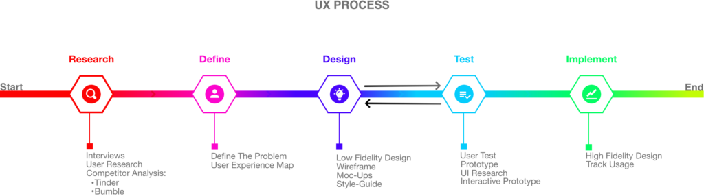
I aim to incorporate the key phases of Research, Define, Design, Test, and Implementation in all of my projects.
For this task, I have started with researching other competitors such as Tinder and Bumble app. I did some interviews and user research with users that have been used a dating app before, I have brought up our new dating app idea with them and collected their feedback. Then I started designing UX Map and defined the problem. Lo-Fi design started with working on sketching on paper, building wireframes, and style-guide. In the test phase, I had some users test the prototype and collected their feedback as well. And lastly, I have used Figma to develop and final version of the app and deliver it to the customer.

After collecting some insights from users and reviewing some existing apps I have decided to sketch the first draft to get the overall understanding of how the app will look like and what is the flow.
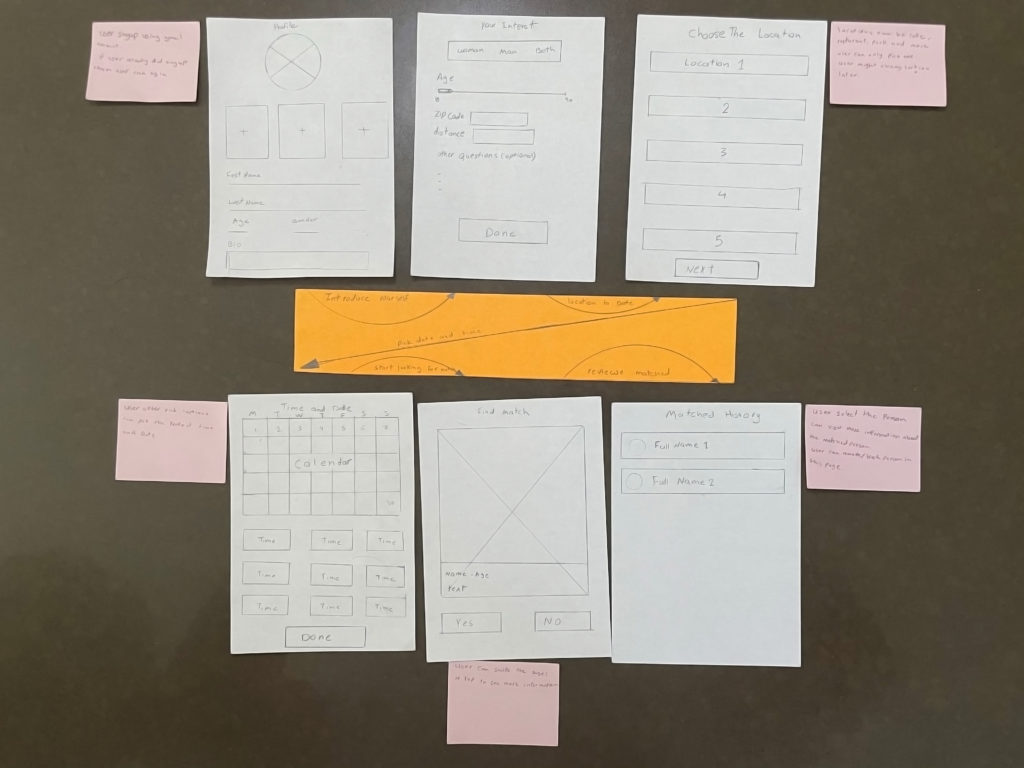
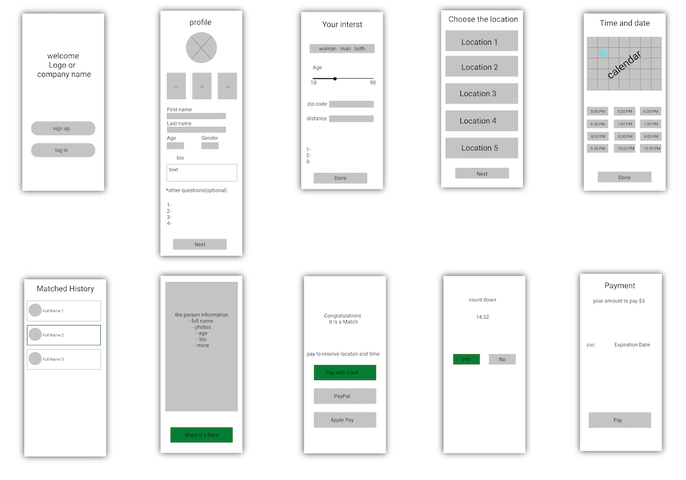
After I have defined the problem and put together the user experience map I have decided to digitize the sketch. In this wireframe, I have roughly designed all the pages needed for this app and the elements that are needed within each page.
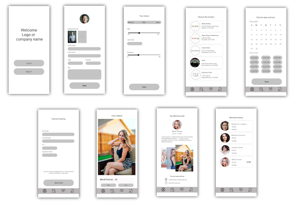
Later I have improved the wireframe above with some real images and a nicer look. After this stage, I have decided to gather some early users to experience the wireframe and I have started to collect some feedback and improve the wireframe until I got to a good stage.
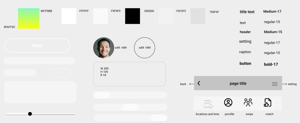
One task before getting to a higher fidelity design was to put together a style guide. This style guide includes the colors, fonts, text size, buttons, and more elements that are designed to be used for this app.
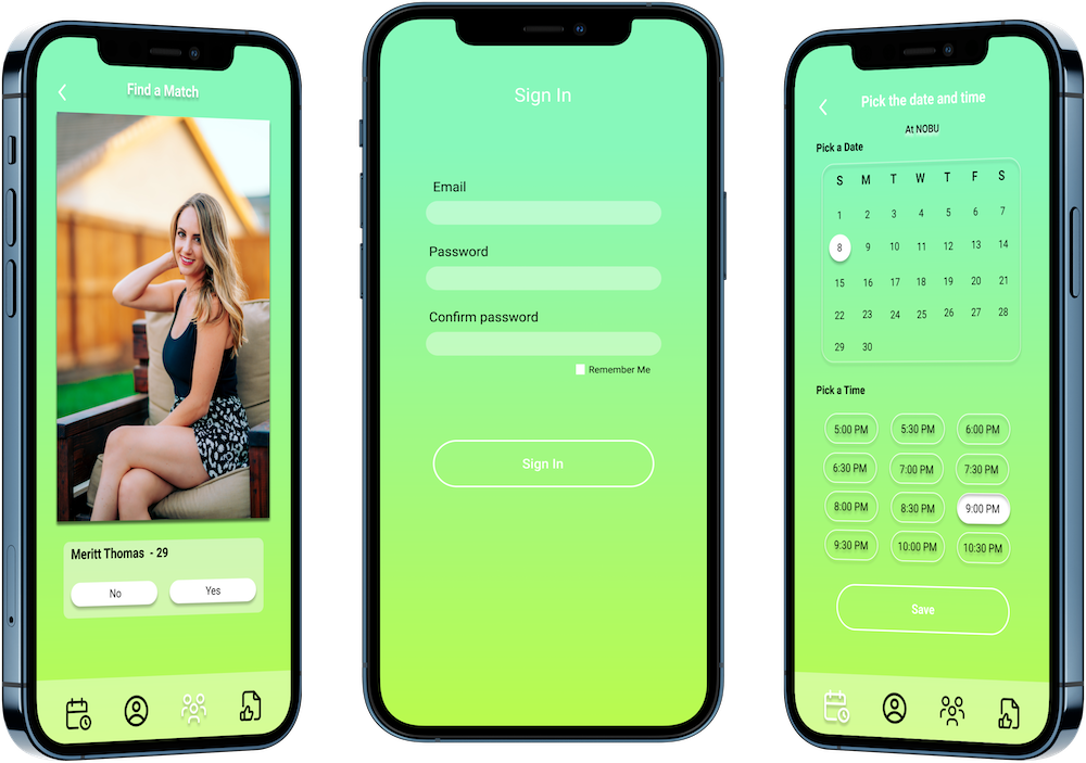
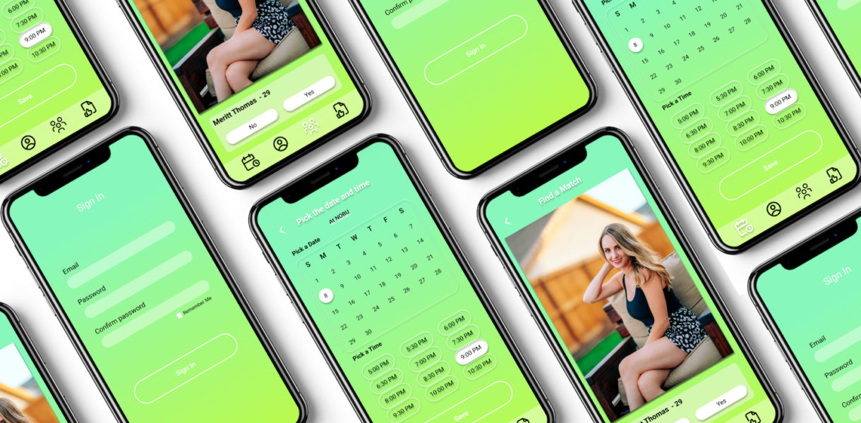
After getting some feedback on the last version of the wireframe, I have focused on the high fidelity design by following the style guide. Below you can see a selection of some pages on iPhone 12 pro.